You are using an out of date browser. It may not display this or other websites correctly.
You should upgrade or use an alternative browser.
You should upgrade or use an alternative browser.
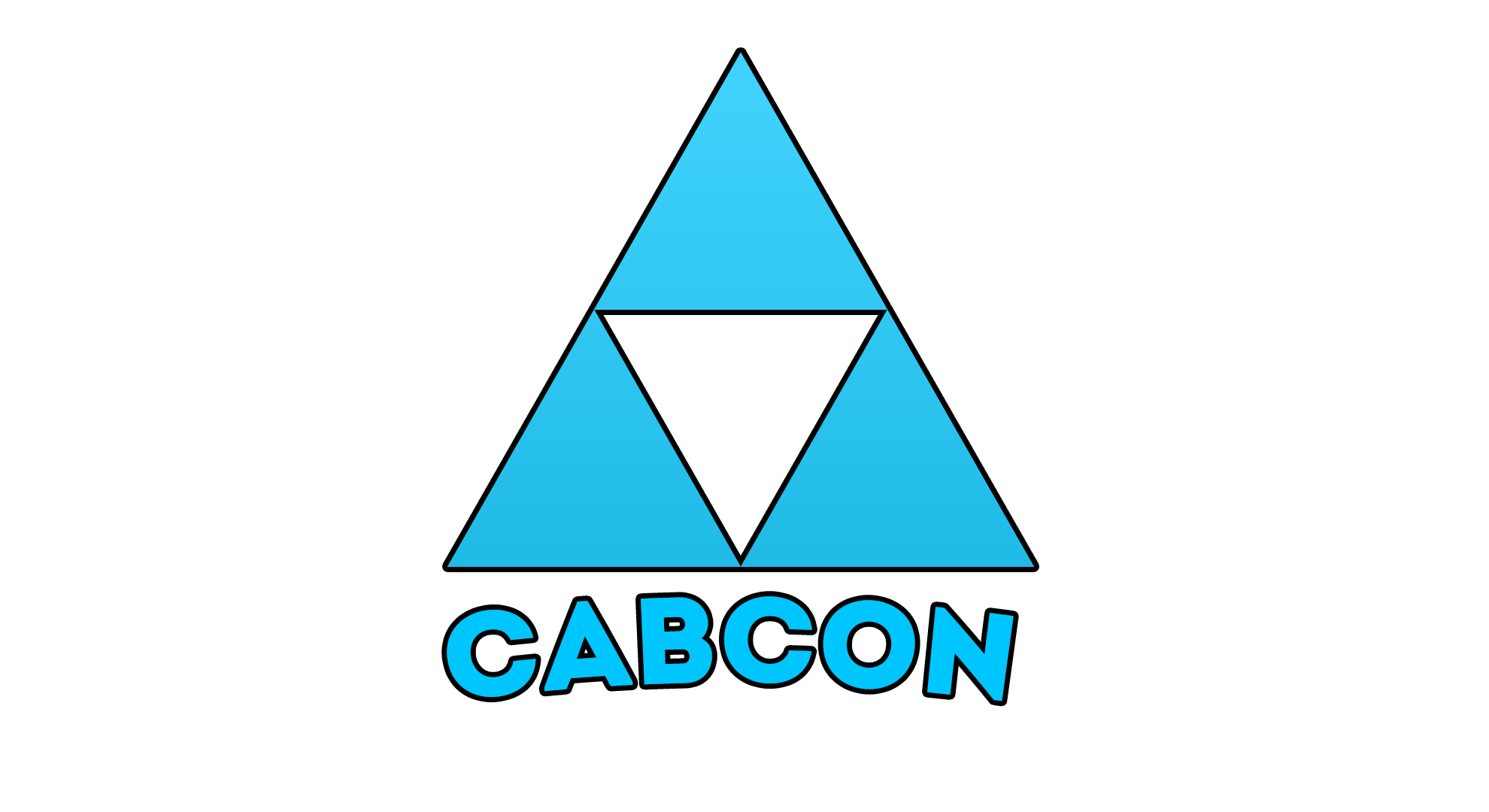
CabCon's new logo (hopefully, pls use)
- Thread starter Craze
- Start date
-
- Tags
- general discussion
- Messages
- 5,016
- Reaction score
- 2,897
- Points
- 1,103
I like the shadow idea but I don't really like the angle you picked.
If you want better, tell me.
 Also maybe add to the font also a shadow
SmartGamingz
Veteran
- Messages
- 1
- Reaction score
- 1
- Points
- 778
its good dont get me wrong but lower the text out of the logo shadow get gradent overlay over it, dm me and ill show an example of what i mean
If you want better, tell me.

iGArabZz
Member
- Messages
- 79
- Reaction score
- 81
- Points
- 18
If you want better, tell me.
This is nice, however, I don't really like the shadow at the bottom over-flowing with the letters. Apart from that, id say you done a great job! Keep up the good work man!
iGArabZz
Member
- Messages
- 79
- Reaction score
- 81
- Points
- 18
Nothing special, but I thought I'd give it a go

Second one is better. As the outline colour on the first doesn't fit with it.
- Messages
- 5,016
- Reaction score
- 2,897
- Points
- 1,103
Goo job, I really like these two. Maybe replace the text with cabconmoddingNothing special, but I thought I'd give it a go


- Messages
- 1,327
- Reaction score
- 757
- Points
- 973
You got itGoo job, I really like these two. Maybe replace the text with cabconmodding


- Messages
- 1,263
- Reaction score
- 965
- Points
- 973
I like the top one with the outlineNothing special, but I thought I'd give it a go
Should make me a logo <3